Search This Blog

Tuesday, May 8, 2012

Website Production


As one of our options, we chose to make a webpage to go with our trailer and poster. 
From our research, we know that most webpages for trailers have links to social networking sites eg - twitter, facebook and youtube - So we knew we had to make sure our page had those things too. 
We've used the same picture throughout (my face) so that our products are consistent so we used the same one again for our webpage as the background but edited it much more so that it was the same picture but looked completely different.

Making the Webpage.


First to make the background for our site, we took the original image and dragged it into photoshop so it was ready for editing. Then we de-saturated it - making the photo look weak, pale, wash-out and dull. We did this so that the 'survivor' looked all of the above so it fitted that particular scene in our trailer. We wanted our target audience to be able to tell how 'she' was feeling and by de-saturating the image, we achieved that.


Next, we added another layer - another copy of our image on top - and used colour dodge tool: washes out colours on image. We used this so again, the survivor looked washed out and tired. 

The Colour Dodge blending mode decreases the contrast to brighten the base colour.


We then used divide layer which allows us to split up the two previous images and add other colour layers such as shadow or black and white to change the overall image.

In this case, we added white to make the face look paler and more frightened.


After that, we developed a footer - the bottom bit with the writing -  we did this so that we could write who the website and trailer was made by and other details. After researching other webpages for trailers, we knew that this was necessary.
We also added an effect off photoshop called 'ghost' which is the people/shadows that you can see behind to the left of my face.
We thought this looked good, almost like these three figures were haunting the survivor which makes the target audience more curious  about the trailer.


The next step was to place the trailer onto the website, we did this on 'HTML'.
However, at the point of making our website, we hadn't quite finished our trailer so we used an example one off youtube for the time being and then added our title at a later date.
We also added text on the bottom of the footer saying 'follow us if you dare' to add suspense. As we haven't made a facebook or twitter page for our brief, we haven't linked these to any sites.


We then added all final touches while the webpage was up and running.
We added 'downloads' so that our target audience could print or download posters for ABANDONED straight off the site.
We added a '15' certificate so people know that they have to be age 15 to view our trailer.
We also moved the social networks and text to the top of the site so that we could fit more information into the footer.


The site we used to make our website was called Dreamweaver HTML, we used this because after using an apple computer to make a website for GCSE IT, we ere already aware of how it worked and how to get it up and running on the internet. 
Our site name - www.sushkelly.co.uk/abandoned - its called 'sushkelly' because of the name that the computer was logged into already and we couldn't change it because we didn't want to risk losing all our work.
Overall, we're quite proud of our webpage for our trailer. We think it looks quite professional.

Thursday, May 3, 2012

How we edited the poster images.

To edit our images, you can use several programs on your computer/laptop, however we decided to go online and see what was available, when we searched in Google, this was at the top, it is called FotoFlexer, it a really good online editor and it was free to you, its really advanced and our images looked really great. 

You upload the photo to begin with, and it helps you can click the auto fix button on the far left which makes your image look better quality straight away.


You can then use the other tools on the (fix) section which make you image look better, for example beginning the brightness and contrast brings out good qualities in your images and highlights areas which a dark, or visa versa.

You can then go on to change the Hue/Saturation of the images, this either adds colour into the images, or takes colour out of the image, this is really good when you want the images to look pale and lost.


This section is where you can change how sharp you images looks, by making it sharper or smoother, you can also select certain parts that you want to sharpen on smooth-en.  

I missed out a section which is where you can change the effects of the image, my using things like (Grayscale, Reverse Colour, Duo-Tone, Paint effect) this is where it directly changes the images by  making look completely different in colours shades and effects, some work really well, but we wanted to keep the image as real and scary as possible, here was the final outcome:

From this

To this

I think this image looks alot better because you can see the darkness under her eyes more, which makes her face look very pale, and the room also looks very gloomy, she looks very lost.


Wednesday, May 2, 2012

Here are the posters we made.

We decided to take the images we have created, and take 2 each (as there is now only 3 team members), we then came together and decided which one with though was the best. Our main aim was to try and created awkward spaces in term of the ABANDONED, we tried to relate to this in our posters.


Poster 1
When we discussed this poster, we thought that the open space was very effective, and we really liked the way the image was edited to gray scale, it makes the picture seem very empty, but haunting at the same time, the tree in the corner also looks good, it has no leaves so it gives a good scary foreground.


Poster 2
The centre of focus in tihs picture is the broken window in the middle, it looks mysterious in the way its completely black inside the house, also really liked the 'watch terror unfold' the way its almost lying across the roof, the problem with this poster is that the spaces created are not very large because your not really looking at a specific open area.


Poster 3
This poster has a brilliant open space, you can see high over the roof and the windows create a huge space being really far apart, i think however it looks slightly amateur with the red writing at the bottom not being very easily identified and i think the image should be a little dark around the edges because I'm not really getting the feel of abandoned.


Poster 4
This poster again has a nice open space, but I'm not so keen on the red abandoned title for some reason, i love how you can see the whole house and it looks quite frightening, i with the images was edited to look a little bit darker.


Poster 5
This poser has 3 windows in it, which does create quite a lot of space, and i think that the images also looked very bright and not scary, i really like the tree in the far right by the door of the house, however i don't think the image is scary enough.


Poster 6
I think this poster out of all the poster is my favourite, i think everything in readable in the picture, from her face to the writing on the picture, there is an awkward space in this picture, but it's not extremely big, but i don't think about that because he face it telling a story for, she looks lost, i don't need anything to sat that for me, we also thought it best to use this poster because when you look at her you feel something, like sorry for her in a way, and people will relate this more than the house, i also really liked the dark eyes and the pale skin, which make her look even better. We are going to use this image on our website also, because we want to have a reoccurring theme, and most other films do so.


Tuesday, May 1, 2012

Images For Poster/Website

We have taken lots and lots of pictures during this process, we have narrowed it down to 6 images that we would like to appear consisting throughout the web page and the poster, which would also be things like the DVD cover ect. The images will all be edited when making the poster they will not remain the original image. The Brightness and Contrast has a major impact on the setting of the photo.

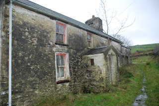
 We were looking for images that had wide spaces, and gloomy looks, because our trailer is called ABANDONED, we want to convey a sense of suttle but scary emptiness in the images, by leaving nice gaps and dark and dull editing.


We really liked the stairs because you can see the footsteps that have been left, and we like how it looks almost dusty and old, which conveys the sense that someone is/was there. The picture of Rosie is also good because she looks so lost. We are going to decide when we make the posters which we prefer.

Sound Effects.

How we inserted the sound.

We used a Sony Mini Microphone that you plug into your computer/Laptop, and this is how the process went, we opened up Sound Recorder, and it automatically picked up the Sony Mic we plugged in, you then click the record button, say what you want, and when you press stop it automatically saves.

When i was record the sound i sat in a small room with carpet and cushions, to reduce the effect of room noise, you can see I'm fairly close and it picked up sound  very well and didn't have to much interference!


Understanding Sound.

It is absolutely vital that you get the sound right for your video - without good sound, are trailer could look sloppy. Therefore we need to plan our sound just as carefully as we plan our images.
If your audience is viewing your work via YouTube, the image might be reduced to a couple of inches wide, but the sound will be as big and powerful as their computer speakers - get that to work in your favour, not against you.
Video produced for handheld mobile devices needs excellent sound to enhance the storytelling, as images are so small. Sound can help you keep your audience's attention.
There are several different sorts of sound that you can use. Using computer editing software, you can layer them in, adjust volume and sync images to particular sounds. Use 'J-cuts', where you lay in a couple of seconds of sound from one clip over the end of the one before, thus leading the audience into the visuals. You can also use a sound bridge to connect different sequences of images.

There are usually TWO types of sound:
1) Diegentic Sound
2) Non-Diegentic Sound

1) Diegentic Sound:
Diegetic sound begins, but doesn't end, with what you record on location at the same time as you capture images. Location sound is often enhanced with sound effects (used to add or heighten individual sounds for narrative effect e.g. a phone ringing, or an explosion off camera). Ambient Sound(outdoors) or Room Tone(indoors) is layered in for realism (and to hide the moment when a plane zoomed overhead or car doors slammed nearby). Dialogue is an important part of diegetic sound, and depends on vocal delivery. A good actor can vary pitch, tone, volume and accent according to what the director wants on set, but an interviewee will only speak in their natural voice. Dialogue can be enhanced in post production, or even replaced as ADR. Sound motifs (e.g. birdsong) can be added as part of post-production sound design, but may seem to come from within the frame.

2) Non-Diegentic Sound
Raw footage is usually enhanced through the addition of non-diegetic sound, usually in the form of music or voice over.
 Music creates mood and atmosphere, often by manipulating the emotions experienced while viewing. Music can be classified as either soundtrack or score.


When you record using a video camera, there are problems such as room noise, this is all the things going out around, for example people talking, electrical appliances and air conditioning. When filming, to reduce the impact of room noise, you can film in rooms that has soft furnishings, such as carpet, curtains and cushions. Room noise can be useful in ways of dead silence, which creates tension to the viewer.

Here are some useful tips for Interview Sound

  • Interview your subject in a quiet place. Ensure that they sit as still as possible and are not fiddling with pens, paper etc that could cause unwanted noises.
  • Point the camera directly at them and place it as close as possible to them.
  • Plug a set of headphones into the camera to check what IT is recording, not what YOU are hearing.
  • Phrase your questions so that they should be obvious within the answers - your audience do not want to hear a disembodied voice answering questions, they want to hear the interviewee talking in as natural and flowing a way as possible. Think of your questions as prompts to get the interviewee to talk.
Remember that you will be cutting back and forth to your b-roll images, and that you can layer your interviewee's comments over different footage. You must prioritise getting good sound. If your interviewee stammers or stumbles over something, or if there is some unavoidable background noise (eg a telephone ringing) wait until the disturbance is over and roll the camera again.

If you look at our interview stage further on in the process we have followed this advice fairly well.

Voice Over

The most efficient way to record a voice over is to find somewhere absolutely quiet (ie with very little room noise - see above) and speak directly into the camera microphone. You can record your own voice overs, or get someone else to act as the "voice" - think carefully about the gender, age and status of your "voice" - all of them will have implications for the meaning of your text.
TIP: Get into bed to record your voiceover - a duvet can deaden all outside noise. Be careful not to wriggle around as rustling sheets are a dead giveaway that you have used this technique.

http://www.mediaknowall.com/sound.html