Search This Blog

Friday, April 27, 2012

Checklist

Simple Checklist


This is a brief plan compared to the plan you saw earlier on in the blog, this is just to keep referring back to and know what and when we have filmed things, you may think that some of the dates are rather far apart, this is because we went to the location several times and filmed quite a few different parts, so that we could edit the shots we took and make it look the best we can.
We have now completed all the scenes we have to film as you can see. The plan in the trailer is to slightly mix things up so it won't confuse the audience, but will still remain scary.
We have now started to develop our posters and our website.


Script.

We have decided to have an interview stage which you already know about from the storyboard, and the survivor will be talking through the interview, and throughout the trailer itself to keep the viewers on track with whats going on.

Here is the interview script:

Interviewer: 'So Rosie would you like to tell us what happened that evening?'
Rosie: 'We were planning a camping trip, it was normal, we did it all the time'
Rosie: 'It was just us 4, and we would make a fire, and tell each other scary stories'
Rosie: 'But this time wasn't like any other time, this time was different.

All of this will be done as an interview and you will actually see Rosie saying it in the interview room, she will also be talking through the trailer, to keep people on track.

This is the script we will add in over the clips:

Rosie: (Fire Scene): 'We were having so much fun, we were laughing at everything.'
Rosie: (Entering House): 'We found a scary house, and i knew there was something wrong, but Mat made is go in.'
Rosie: (Blank Screen1): 'Mat started acting funny, and it was really scary.'
Rosie: (Blank Screen 2): 'And things started to go wrong from there' (weeping)

We also have other talking parts of the movie but these were not planned and simply emphasise the scary impact of the film.
We have to remember that people deviate from the script so they don't sound like that a reading it from anywhere, so when Rosie is talking on film, and off film (when recording sound effects) it not going to be the exact script.

Wednesday, April 18, 2012

The Survivor.

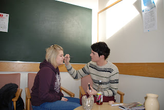
We decided that Rosie would be the survivor because she didn't really mind, we gathered up make-up that was really pale, and black things for around the eyes, and some hairspray to make her look a little rough. Our aim was to make it look like she had been through a traumatic experience, and we would film the interview stage while she looks this way.


Final Outcome


Costumes.

We decided that we would have to have a fairly normal costume because we are only going camping in the beginning so things that would keep us warm are essential.
Here was my costume:


I choose the warm jumper because it would keep me warm, and the trousers are slightly farmer-ish, and the boots will help when its muddy.

Other group members did the same as me, the wrapped up in hooded jumpers, large coats, wellys and many other things.

We understands the importance of costumes because is a Zombie/Monster thriller all the clothes would be ripped and blood on them, if we did this, it would look silly.

Props.

The Props we have collected are:

Fishing wire-For the supernatural.

Old Chair-To rock in the trailer.

Cups/Jars-Smash and make loud noise.

Tripod-Keep the camera steady.

Video Camera.

Camera.

Metal Tin- For the camp fire.

Fire Wood- To light the fire.

Torch- When its dark.

Make Up-For the ill looking survivor.

Invisable String.

When we are making the trailer we are going make supernatural things happen, but you may be wondering how we are going to this, we have tried a few things like string are rope but you can see it on the tapes. What we have decided to use is invisible fishing wire, which is very strong and can't be seen on the tapes.

Text in Trailer.

We have decided that we are going to add text at the start of our trailer as the story board shows, however we are also thinking about adding some in when the atmosphere starts to get more intense. Here are a few ideas we had.

Beginning:
                                        ONE
We think this text gives a little too much away, it tells is that there is one survivor, and its a girl, and she is the one going to be telling the story, it doesn't really have any significant scary part, where it says 'only one survived to tell the story, is a little long winded and takes the scary aspect away.

                                         TWO
This is better than the first one because it doesn't give as much information away, however i think the bottom part is still a little long winded.


                                           THREE
This is my favourite because its more to the point, and prepares you for the things your about to see, it doesn't give to much away, and the bottom text is short and snappy, which gets straight to the point.


Middle:


                                          ONE
I think that this sets us up to prepare to be scared, so i don't think this should be used in the trailer.


                                             TWO
 I also think this gives to much away, and doesn't create much tension, which is worse.

                                             THREE
 This is the best one because it doesn't set the viewer up to be prepared, and it does create tension.

End:

 This is the title we chose earlier on in the process.

Trailer Storyboard.

This is a brief outline of what we have visioned the trailer to look like.


I had to take a picture to put the image on my blog, that is why there is a date on it. If you read the writing carefully you will see we are trying to achieve a calmer state at the begining and a more upbeat atmosphere at the end. Underneath some scene's you can see there are soundtracks, these will be sounds we will be entering ourselves. This is not a hard copy because along the way we may have to change some things but we would like to use it as a good base line.

Tuesday, April 10, 2012

Plan (Discription).

I have had to press the PrtSc button on the plan and then paste it to create a picture.
If you find this hard to read, you can go to the bottom right hand corner and increase the size of the screen, be sure to re-set it back to %100 so the rest of the blog looks normal and fits on one page.
This is also not a HARD COPY of how are trailer will be produced, this is what we are filming to keep things nice and neat, however in the trailer this should all be mixed up so, we do not wan't to make our trailer look like a story.


Production Name.

The production company is responsible for both the development and physical production of new media, for example performing arts, film, radio or television programs.

Some major production comapanies you should recognise are:


We have to create and develop our own film, so we need a production name, we decided to call our production team RACM Production, simply because we are called Rosie, Amy, Charlotte, Mathew. We have also created a logo.


Tuesday, April 3, 2012

ABANDONED-DESIGN.

ONE
This is a very simple title which was the font Arial Black, i don't think its very Horror themed, however i do like the clarity of the writing, which makes it easier for you audience to see the title.

TWO
This was also done in the font Arial Black, however i also believe that it's very clear, and being in the colour red, it stands out even more, and gives you a bigger sense of horror.

THREE
This font is call Agency FB, it's a very narrow font, it looks more obscure and fits better with the mysterious element of the film, i still don't think that the font its self if scary enough.

FOUR
This is the same font which is Agency FB, i am trying about the colour red because it resembles blood, horror and gore, but i am beginning to realise that to much red with the white outline looks a bit fake and amateur.

FIVE
This font is Bodoni MT Condensed, which looks a little more old fashioned and mysterious compared to the others, i like this font because it gives an element of horror in itself, i made the spacing very far apart so you can see it clearly.

SIX
This is called Bradley Hand ITC, and i think its brilliant in terms of relating to horror, i also believe its mysterious and the way the tips at the end of the words extend, it looks designed for horror

SEVEN
This font is called Chiller, which is the main reason for choosing it, however i don't thing that it looks scary enough.

EIGHT
This font is called Eras Bold ITC, it's very clear again and looks nicely spread apart, its not very mysterious, and looks a little to simple.

NINE
This is called Papyrus, and it looks really good, its got a sense of mystery and its easy to read, it looks like it has an element of old in it, because its slightly rough around the edges, it seems like it would go well with our film.

TEN
This is called Tempus Sans ITC, and it looks nice and spaced out, however I'm not convinced that this is mysterious enough and doesn't give a big enough feeling of horror.

ELEVEN
I like this font because it looks very old fashioned ,and i like the way i put i thin red line around the outside which adds the sense of horror into it, it's called Bodoni MT Condensed.

TWELVE
This a variation of the font i used earlier called Bradley Hand ITC, it was one of my favourites and i think it looks alot like a horror film title, but it looks a little to fake for my liking.

THIRTEEN
This is another variation of Bradley Hand ITC, and i think it looks good, but again a little to fake.

FOURTEEN
This is also a font that  i have used before it is called Tempus Sans ITC, i have tried to incorporate more horror by making it hollow, i do like it but it looks to animated.

FIFTEEN
This is my favourite, it is a font called, and i gave it a black outline as well as a background, which made the wringing shrink a little round the text, this made it look alot more horror like, and it looks mysterious, with the wide spacing it is also really easy to read. I think this is the choice i will make.